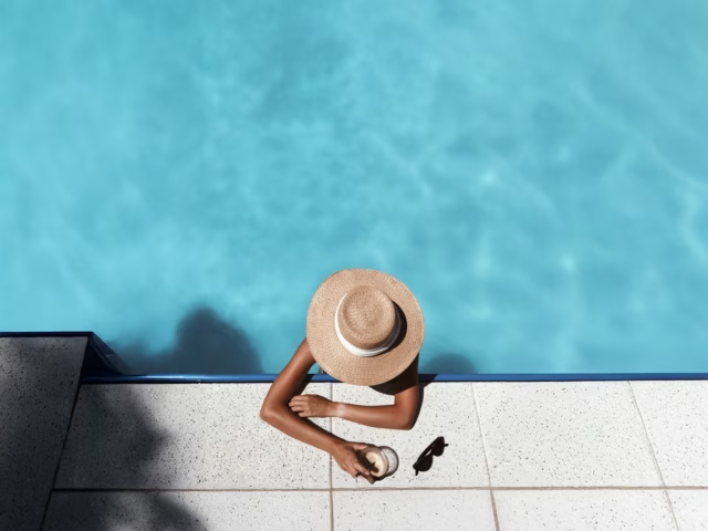
We are happy to present our last Magazine Ad Design, created for Mind your Language school Thailand. The ad design is created to be published in a printed magazine. A full A4 page of creativity.
Ad Design Editorial design is different from Digital Ad design, or Social Media Ad design as we described in the previous post about Mind Your Language school.
When you post a social media ad or even just a post, you have a space in the caption, and the user can click on your profile to know more, and even to find your website. With printed designs, the situation is different, as you only have a limited space to promote your brand or special offer. You also need to be aware of the type of the magazine, in which you will be published. An advertisement for a business magazine, will not be the same as for a fashion magazine.
In the Magazine Ad Design for Mind your Language school, we made an accent on the atmosphere of the school. The orange color is chosen as one of the colors in the Logotype. We also used a QR code, so anyone can quickly get to the contact page of the school, and get a free test class. In today's society respecting the time of your customer is very important. You will more likely have a customer who will scan your QR code, instead of going to a website, as it'll take too much time to tap its address and open the internet browser.
It was also important to use the different logos of the school's special programs.

Flexibility is key
A good design is easy to use in different formats, without losing the eye-catching and informative part of the design.

FAMEsolutely is happy to help you to bring your business to a new level!
We like to share our experience and PRO TIPs, check out more of our blog posts below!


![[SOLD OUT] Digital package: 360+ Customisable Instagram captions templates & Pro tips for Holiday villas and hotels + 60min online coaching](https://i0.wp.com/famesolutely.com/wp-content/uploads/2021/03/2online-shopping-beauty-concept-satisfied-asian-female-customer-showing-okay-making-purchase-internet-smartphone-standing-pink-1.jpg?resize=640%2C480&ssl=1)


